Making our Android App Accessible

In 2011, Bloco was inspired by the work of two friends and we decided to develop an app called Large Text (LT). This was meant to be a simple and fun app with one particular feature: display text full screen, as large as possible without compromising usability. What for? Ordering drinks in a loud bar, greet someone at the airport or just share a message with friends.
Some time went by and we had a very pleasant surprise with Large Text, one we weren't expecting at all, but surely put a smile on our faces. Many people have reached us through the app's reviews, to share their stories about how LT made a difference in their lives.
Here are some examples:
Communicating through car or shop windows in times of Covid-19
Helping receptionists with Deaf and Hard of Hearing customers
Sons and daughters whose parents' hearing and sight have deteriorated and LT helped in the communication process.
Nurses in a hospice that installed the app because it helped them communicate with deaf and partially sighted patients, etc.
This was music to our ears, since we've been wanting to explore the accessibility component of our apps for a while. Although the Android system provides some solutions they are often insufficient if the application is not designed to be accessible.
With this feedback in mind, Bloco decided to redesign Large Text. Making it as inclusive as possible was our goal, as all of us will have some kind of disability in the future. Mind that not only highly disabled people benefit from accessibility. If you break an arm, that's a temporary disability, if you try to listen to audio in a very loud coffee shop, that's a situational disability.
It's important to understand that we are not working for a "minority". According to WHO’s report on disability, an estimated 15% of the world population lives with some form of permanent disability, and at least 2.2 billion people have a blindness and vision impairment around the world. With Deafness it's no different, 466 million people are estimated to be living with hearing loss, that's 6.1% of the world's population.
Using an Accessibility Scanner
So with all these stories in mind we've decided to run Google Accessibility Scanner on Large Text, document the findings and share our conclusions.
For those less familiar with this tool, Google Accessibility Scanner suggests accessibility improvements for Android apps without requiring technical skills. These improvements range from enlarging small touch targets, increasing contrast and providing content descriptions so that your app can be easily used by individuals with accessibility needs.
You can check a small portion of the test in the video bellow:

In the end we were given several suggestions, but all of them were based on 3 types:

1. Item Labels
2. Text Contrast
3. Touch Target
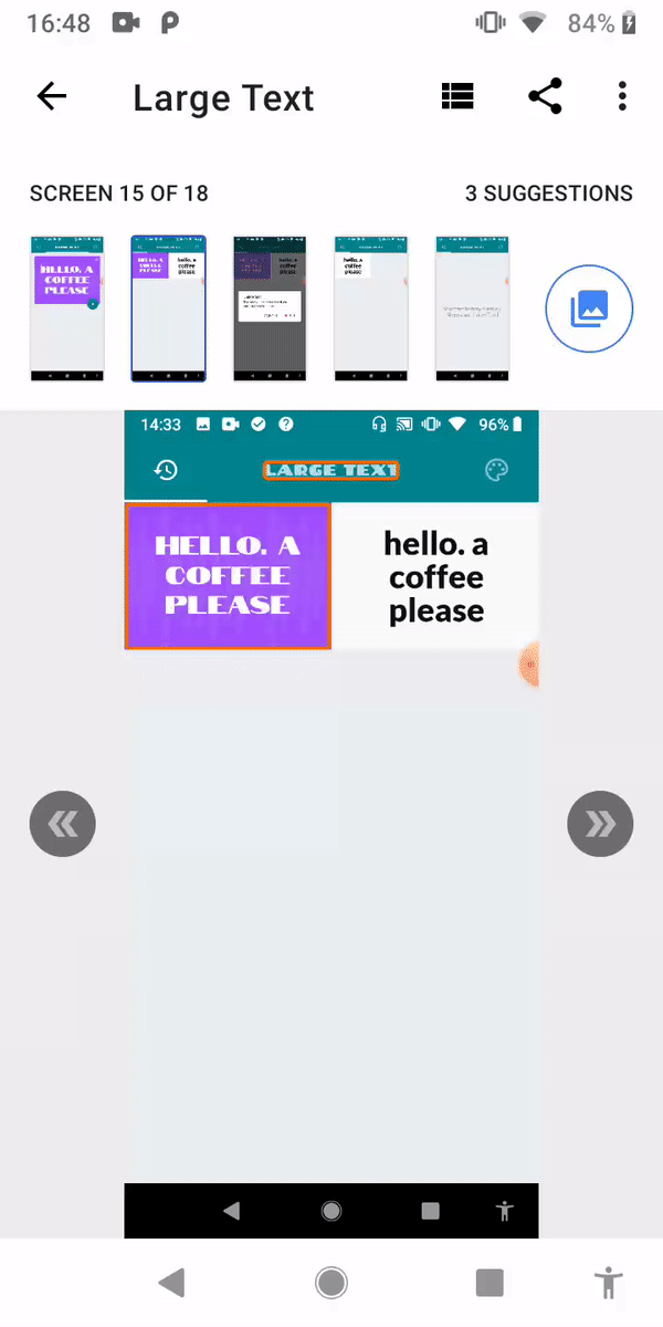
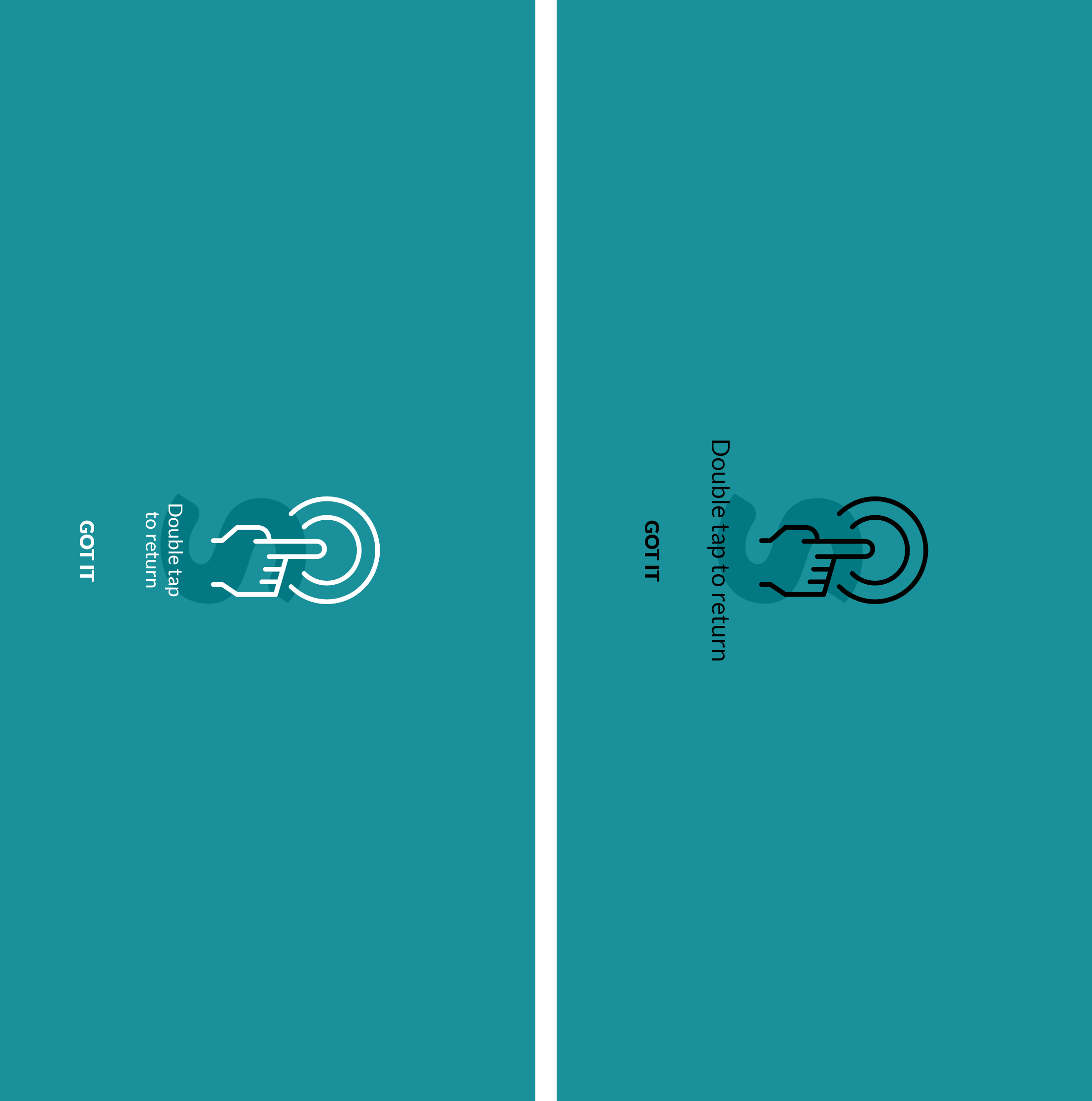
Image 1. Item Labels
This item may not be have a label readable by screen readers, and this presents a difficulty for some users. As you know, visually impaired users rely on content labels to understand the meaning of the elements in an interface. The solution we came up with was to basically provide a text description of the label describing the action or purpose of that view.
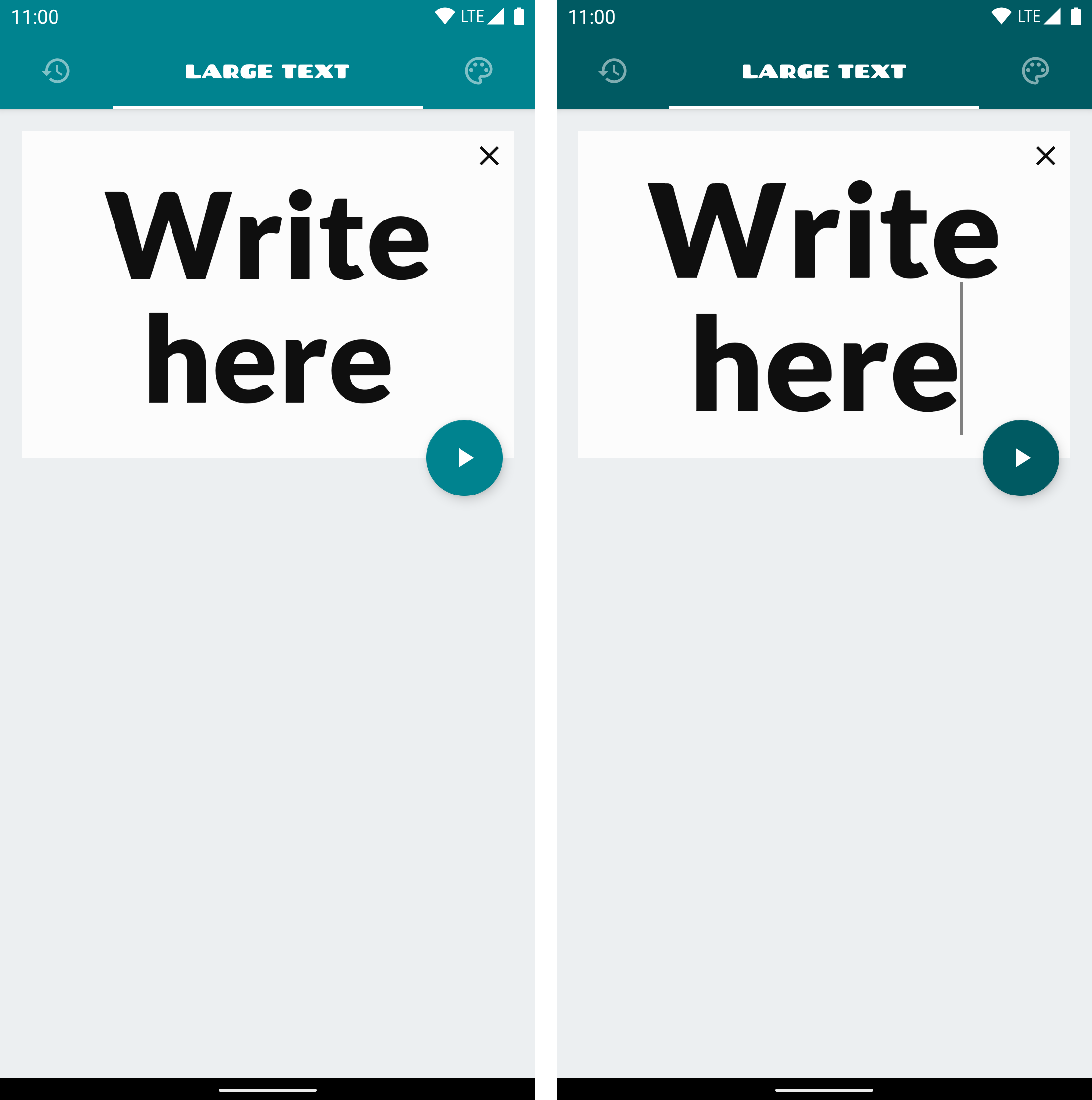
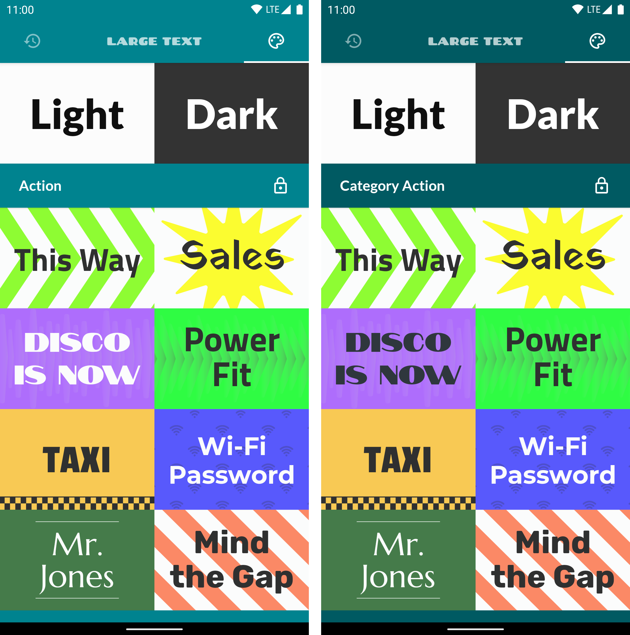
Image 2. Text Contrast
The item’s text foreground had an insufficient background contrast ratio. The colours we choose affect how easily users can read and understand text. The right colour contrast will benefit users with varied visual impairments, including low vision, and color blindness for example, but also the situational disabilities aforementioned. With these suggestions in mind, we took the time to reevaluate the apps' color pallet so that it is as inclusive as possible, making no distinction between sighted, blind or visually impaired. As you can now see (image 2), the entire app displays a new "vibe". We changed the new color pallet on the app and some themes in order to allow an easier contrast.
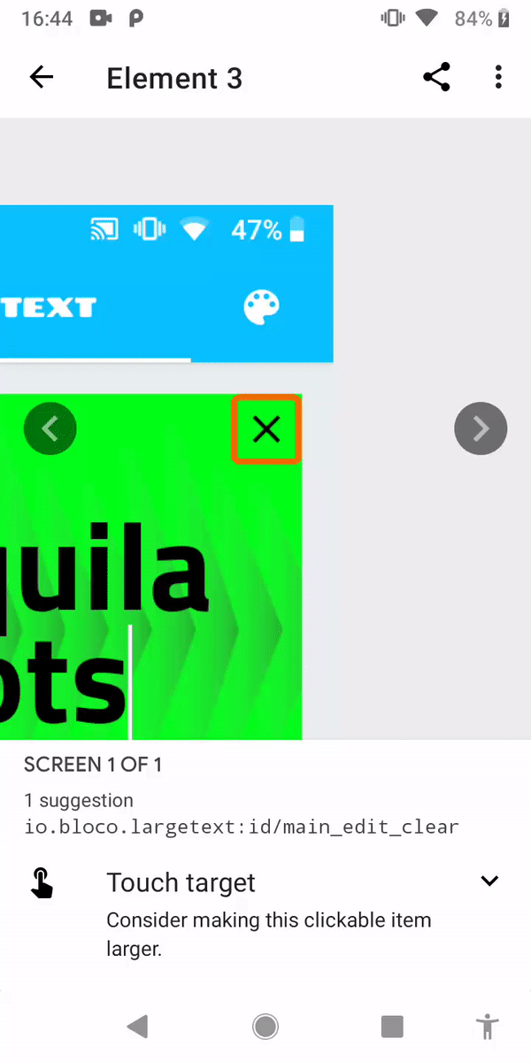
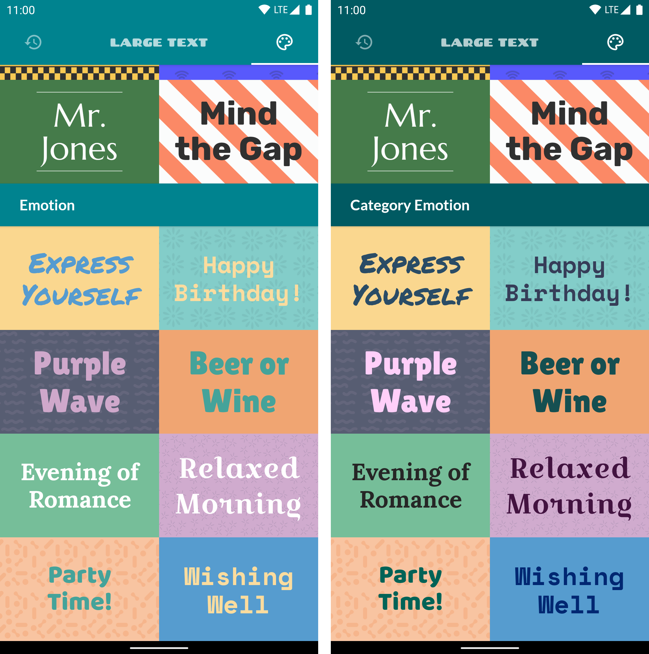
Image 3. Touch Target
The scanner identified the (small) size of the clickable items, or touch targets, like the small x button you see on the image. Anything you can click, touch or interact with should be large enough for a consistent interaction. You can click here and find out more about finger-friendly design. We expanded the touch zone of these small sized buttons to ease the interactions for users and made some improvements with labels such as the separation of the "theme categories" to allow a more clear app context.
You can compare the end result bellow:
Before And After screenshots
While most of these fixes were easily spotted in the comparison above one suggestion in particular required a more, hands on approach. Let’s take a look.
Talk Back
For context, label is the information used to describe what is being displayed on the screen. While text can be simply read, images and backgrounds are a different story. They need "labels", and these are read by the Android System Talkback accessibility feature. If you want to find out how this feature works, we recommend you take a look at one of the "The Blind Life" videos.
To tackle the Item Labels suggestion we went ahead and turned Talkback on and explored our app. We quickly identified the problem and fixed it.
The videos below show the before and after Talkback audios, and it's clear that after the alterations the new main screen and history screen have a cleaner and more contextual sound than before.
Before
After
Previously, all that was read in the history tab was the text. Now, in the history tab and all other screens, not only the text is read but it also includes the theme name being used on the message as well.
As you can probably tell we were inspired by our users's stories and that made us want to improve our app and make it more accessible, beyond the suggestions even, in the hope of facilitating their lives. One such improvement included changing the item labels in all screens, instead of the one suggested.
Conclusion
After all these changes we got Google Accessibility Scanner full approval and achieved a more accessible app for everyone without interfering with the functionality of the user interface.
And in more technical terms, when building apps it's normal to use views to make the app a little more aesthetically pleasing or simply to achieve a specific end result. While these are good practices, being accessible should always be taken into consideration.
Simple tags such as #importantForAccessibility and #contentDescription, or a simple contrast check may seem like small changes but are enough to create a more accessible app to all users and that can be the difference between a good experience or a bad experience for a person with a disability.
With this we also hope to raise awareness about accessibility and inclusion and that they cannot be the exception but have to become the rule.