Android Edge to Edge 101

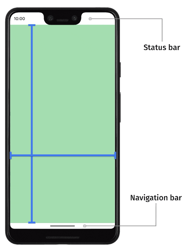
Typically apps go from the navigation bar to the status bar. With the release of Gesture Navigation in Android 10, drawing behind them became more practical and visually appealing.
The official documentation for this feature is detailed and useful, we even borrowed a few images for this guide. But we noted it lacked a few key points and details we had to figure out along the way. So we decided to write our Edge to Edge 101.
101 - Types of Navigation
Since this is article is 101, let's start with the very basics of the 3 existing system navigation systems. While edge-to-edge is not exclusive to any type of navigation it is most often associated with Gesture Navigation, feel free to skip if you are only interested in Gesture Navigation and Edge to Edge.

Gesture Navigation, gesture navigation frees the screen by simplifying the navigation. We can make use of that space to actually display more information. This simplification comes at the cost of 2 buttons, replaced with gesture detection at the following zones:

Edge to Edge implementation
Let's take a quick look at our app Large Text in all navigation variants, before making any changes.

After using other apps like Android Messages, this black navigation bar starts to call attention and look ugly, maybe even a bit sloppy. Above, we already made the status bar colour match our AppBar. It's not being drawn behind, it simply has the same colour.
Following the documentation, we used WindowCompat.setDecorFitsSystemWindows(window,false)on all our screens, made the recommended themes.xml changes below.
```xml
<!-- values-v29/themes.xml -->
<style name="Theme.MyApp">
  <item name="android:navigationBarColor">@android:color/transparent</item>

  <!-- Optional, if your app is drawing behind the status bar also. -->
  <item name="android:statusBarColor">@android:color/transparent</item>
</style>
```
And here's the result:

Our app now looks great on our Pixel 4a running Android 11 (API 30), on any navigation mode. But let's check an older but still popular API/Device, like our Redmi 7A, running Android 8.1, still using our configuration above.

Here we can see a few nuances between API’s. While we could expect this behaviour after reading the documentation more in detail, it's still a bit annoying.
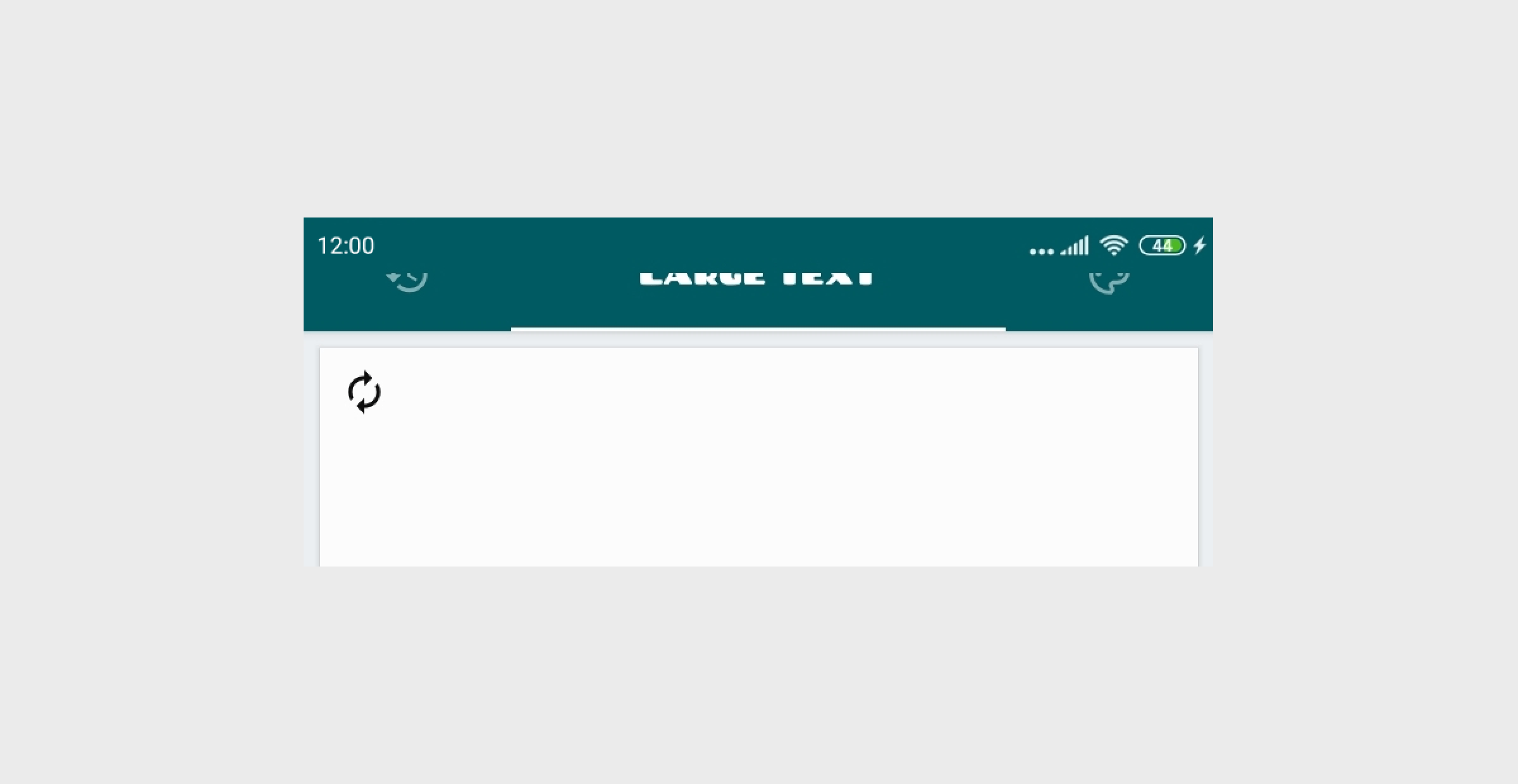
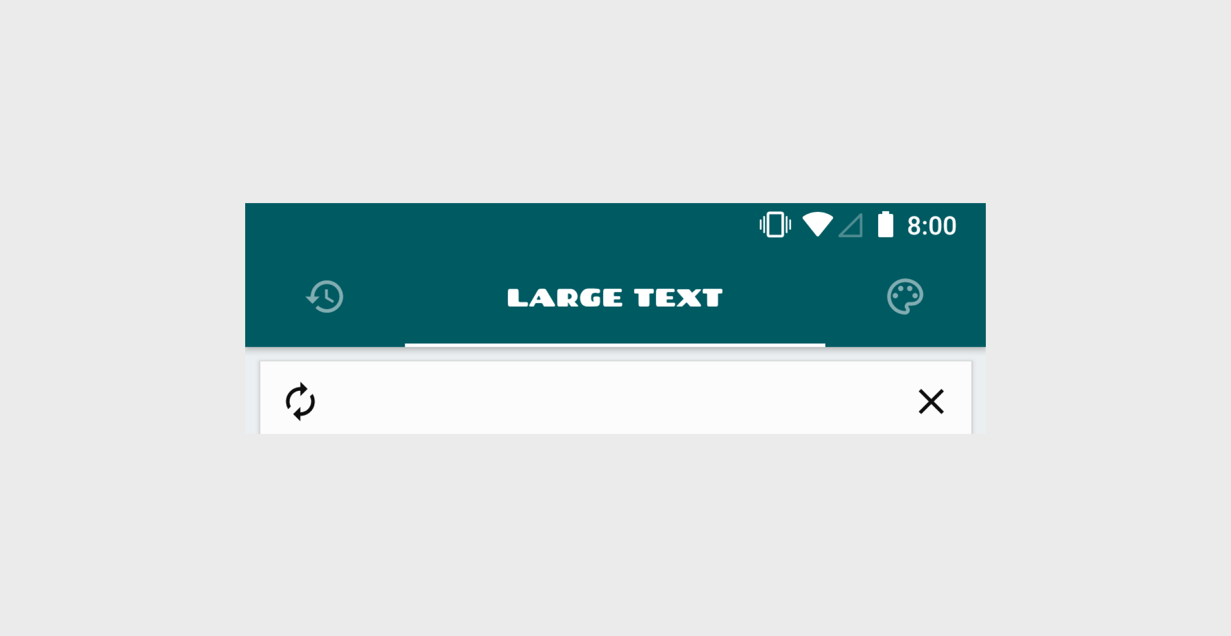
The navigation bar buttons' contrast is simply not right.
The status bar is drawn on top of our AppBar.
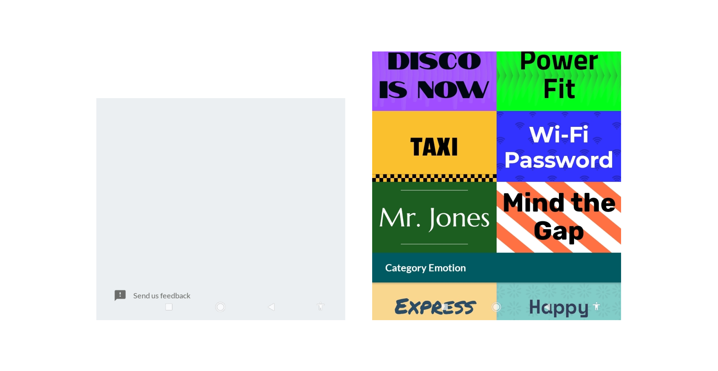
The feedback is so close to the navigation that a user will probably misclick it.
Should we just use edge-to-edge for APIs above 29 (Android 10)? Well, we could, but we feel like we can achieve a similar result on all APIs, and offer a better experience regardless of them having the latest Android device.
To save you the time of reading through various StackOverflow threads and Github repositories, we will give you everything you could need here (just below). If you feel something is still missing, feel free to leave a comment.
Nuances and solutions
So, we now understand Edge to Edge, read the documentation, made a few line changes to our theme. Our work is done, right?
Maybe a Hello World app. But in real apps, like our Large Text, there were some important nuances we had to tackle. Let's describe them one by one.
Translucence
This is one of the nuances we talked about above. It happens with devices with API level 28 or lower using the button mode navigation system.
"Button modes: The system applies a translucent scrim behind the system bars (for API level 29 or higher) or a transparent system bar (for API level 28 or lower)." - Documentation
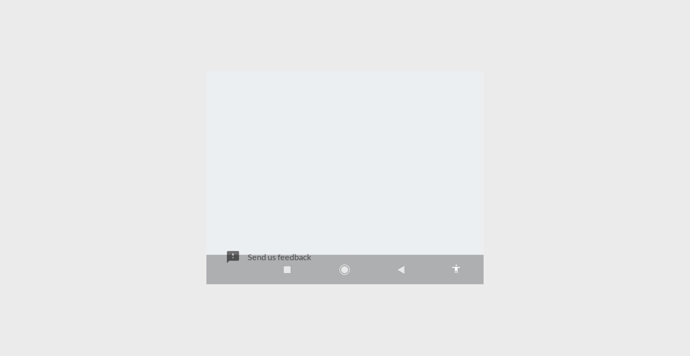
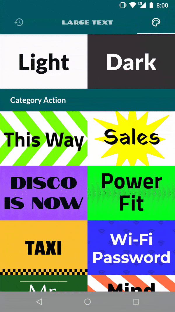
I believe most of us will target API levels below 28 for a while, and it would be great to support a better UI there as well. Taking a look again at our Large Text app on Android 8.1 (API level 27).
Here the UX is bad, you can barely see the navigation buttons, and they overlap with our feedback button and with our Themes grid. A user can easily press the back button instead of the action they intended.
Solution
First, let's deal with visibility. The documentation says that this only happens on API levels 28 and below. So the solution is simple, have 2 different themes.xml for 2 API targets.
theme.xmltargeting API's 29 and above (recommended in the documentation)
```xml
<style name="AppTheme" parent="BaseAppTheme">
    <item name="android:navigationBarColor">@android:color/transparent</item>
</style>
```
theme.xmltargeting all other API's (to have a similar feel)
<style name="BaseAppTheme" parent="Theme.MaterialComponents.Bridge">
    <!--
     ...Your other configurations...
		-->
    <item name="android:windowDrawsSystemBarBackgrounds">true</item>
</style>

<style name="AppTheme" parent="BaseAppTheme">
    <!-- <item name="android:windowTranslucentNavigation">true</item> might not work with some devices (like our Redmi 7A)-->
		<item name="android:navigationBarColor">#44000000</item>
</style>
The translucency is solved. Now let's tackled the overlap.
Handle overlaps using insets
With our application drawing behind both the navigation and the status bar, some views need to be repositioned. But we need to consider that the navigation bar height is variable, depending on the Gesture Navigation mode selected. So it's not as simple as adding static paddings or margins to your views.

The official documentation discusses this issue and offers a solution on how to solve them. But here we want to go a bit further and talk about a few specific cases:
AppBar
Floating Views / Navigation Bars
Scrollable Views
And while the documentation solution talks about using the setOnApplyWindowInsetsListener, we will be using the simpler Insetter library, developed by Chris Banes. You can read more about this library in our blog post.
AppBar
The app is now drawing behind the status bar, but the status bar content will still draw over our content. This can create issues with our AppBar appearing to be cut.
Insetter.builder()
    .padding(WindowInsetsCompat.Type.statusBars())
    .applyToView(binding.appBar);
or Kotlin
binding.appBar.applyInsetter {
    type(statusBars = true)


}
We get a clean App bar behind the status bar.
Note that we're using padding. If you use margin instead the status bar would show the color of the activity background, since the AppBar is pushed down.
Floating Views / Navigation Bars
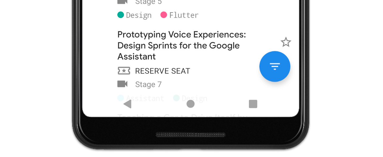
Views can also appear behind the navigation bar, a problem similar to the AppBar one we tackled above. Let's take a look at our feedback button.

Solution
Like on the AppBar, we just use Insetter:
Insetter.builder()
    .margin(WindowInsetsCompat.Type.navigationBars())
    .applyToView(binding.mainFeedback);
Problem solved:

Scrollable Views
Lastly, scrollable views. What's the difference? Clipping.
By default, a ViewGroup clips its children. That means, if we just add padding, your elements won't really appear behind the navigation bar. Take a look at the difference between the two behaviors side by side:
RecyclerView with bottom padding
RecyclerView with bottom padding, but disabling clipping
Solution
Add padding with Insetter and disable clipping:
Insetter.builder()
    .padding(WindowInsetsCompat.Type.navigationBars())
    .applyToView(binding.themesList);
<androidx.recyclerview.widget.RecyclerView
    ...
    android:clipChildren="false"
    android:clipToPadding="false"
/>
Conclusion
While Edge to Edge support is not complex, it has its tricks. Reading the documentation alone might leave you with the feeling that it's only a few line changes, and everything will work on all APIs.
We wrote this article to go beyond the official documentation. To provide the best Edge-to-Edge experiences for all your users, regardless of API level their phone supports. To cover nuances that you most likely will encounter, and how to solve them.
In summary, here are the changes for a full Edge to Edge support:
Add
WindowCompat.setDecorFitsSystemWindowson the activities you want to support;Different Themes for different API levels (One for 29+ and one default for all others);
Margins and Paddings according to insets to avoid overlaps with the status and navigation bars;
And lastly, Scrollable Views may need attention with clipping.
Our Android Template also comes pre-configured with this and other things we find useful. If you want to jump straight into development, take a look at it.